Monday, 8 May 2017
Wednesday, 26 April 2017
Monday, 17 April 2017
Evaluation Question 4
Evaluation Question 3
Evaluation Question 3 - What have you learned from your audience feedback
For this question i thought one of the most efficient way to get feedback was to used 'Survey Monkey'. As i could then generate visual aids to the results which will help me comprehend the successfulness of my products.
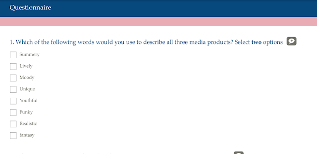
Question one:
From this set of results, 'youthful' and 'summery' were selected by the majority to describe the essence of my products. The audience clearly understood the market and was well aware of the atmosphere that the music video transported them Into. The upbeat track accompanied by fun and lively visuals of the music video really struck the audience as exciting and visually pleasing.
The fact that mostly all options were chosen at least once shows how versatile the producuts are which creates a variety of audiences responses. However as the verbs are all similarly associatedthis also creates links and a strong brand image.
Surprisingly, non of the respondents selected 'fantasy' which i found that slightly challenged genre conventions. For example, the tropical house genre is heavily based on idyllic locations that are mesmerizing but almost unreachable to many. Likewise the genre also is dominant on creating a narrative music video with strong elements of conceptual serialism. I tried to incorporate this using by having the element of uncertainty as it is revealed at the end that the protagonist had awakened from daydreaming in attempt to relax underwater but running out of air. This concept of fantasy did not come across as clear to the audience, meaning that perhaps i needed to add a pre sequence before the music video started to establish the true reality first.
Moreover the audience also didn't get the idea of false reality and reality through the connotation of light and dark shot types as i contrasted very light moving shots, such as pans and tracking shots with still close ups of a dark background of a strange figure sip singing. This element of fantasy was also not as clear as i hoped and was a very minute and dense analysis for the audience to pick up on as it seemed too visually pleasing and lighthearted to have a dark undertone.
Question two:
Results:
From the results it is evident that my target market of 16-25 year olds was clearly identified by the respondents. This was clear through the use of adult motifs such as a girls holiday which is only probable if the characters are portrayed as mature and of a certain age that does not make them seem vulnerable. Likewise the use of the male gaze is also prominent which would make it unsuitable for audiences of a younger age as the characters are seen to be wearing bikinis. Likewise the club atmosphere denoted through the UV face paint also is a mature motif as only at the age of 16 or 18 for others would the target audience identify with that location and drinking, as well as the party atmosphere.
However one of the respondents selected that the target audience was 11-15 which i believe is inaccurate due to the inderpendantness of the characters and their physical physique as it is obvious they are fully developed. Perhaps the fact that the characters are seen to interact with childhood activities that may have suggested a younger target audience. Likewise, the fact that the characters never enter a club atmosphere or are seen to be taking adult content such as alcohol and drugs also make it more appropriate for younger audience members.
moreover the use of pastel light colours such as baby pick also opened the brand up to a younger audience as that colour is normally associated with a young soft girl. As pink is the dominant colour it may give off this younger appeal that the respondent identified.
Question 3:
Results:
The results from this question varies, however 6/10 said that by NOT having the artist feature in the products took away from the brand identity which suggests that my products were in fact successful.
'Yes': respondents that felt it did take away from the brand identity
Both these pieces of feedback are just proof that not everyone will take a liking to the tropical house conventions of not being able to identify with a human being. This is understandable as music icons are often seen as role models to their fans, and in my case this is difficult as you are unable to see who they are. Likewise the brand identity can also be seen as muddled as also though there are clear themes and motifs, the artist's sound will vary as they are a DJ rather than a singer with a distinctive voice. This is why i have chosen to have an absence of the DJ themselves as the brand is about reoccurring concepts and the atmosphere of the recognisable music rather than a distinguishable single voice.
'A bit': respondents that felt that the brand identity was only hindered a small amount:
These two respondents had mixed feelings on the missing presence of the true artist which is clear that a visual face to identify with is crucial and perhaps more preferable. However both pieces of feedback understood that this was a creative decision that was either apart of genre conventions or that it only made a small difference as there was plenty of characters for the audience to identify with.
The feedback stated that the products are still memorable and had an impact of them despite the missing element. Likewise one of the respondents stated that the combination did establish the brand identity through the consistency of the motifs and the fact that they were not contradictory
NO: Respondents that felt it did not retract from the overall brand identity and impact.
The majority of the feedback on this question was positive and even if they mentioned a posible negative they were clear to say that this was overcome by the overwhelming sense of genre convention and vibrant visuals. Most of the feedback stated that they understood genre conventions that that this was a creative decision that added to the atmosphere of the products.
Question 4:
Results:
The results from this question was also surprising as the most identified music genre was 'Dance' and not 'Tropical House' as expected. I believe that this may have been confused by the mix of two songs as one was a very know and current dance electronic track. However this is still part of the 'House' genre due to the backing track. Likewise this may have been confused with the dance choreography sequence at the 'beat drop' of the song'. However I am still unsure as to why the respondents categorize this as dance rather than tropical house as the mixture of club atmosphere and cuts to the tropical location.
The answer may lye in the fact that tropical house music is a very new and recent genre that the respondents may have not been familiar with. I feel like the setting of my music video and the background of my digipak and advert alone, establish that it is of the tropical house convention just by using a exotic location .
Question 5:
Results:
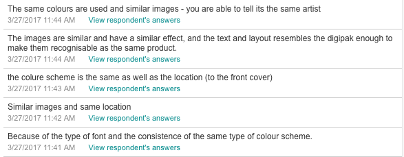
In terms of location, all the pictures were featuring a idyllic and exotic setting in both products which made it contestant. Likewise the style of the photo in all pictures were realistic and tasteful with the characters either facing away from the camera, of masked using an prop to mask their identity. However to show variation i used a mixture of dark and light colours within the digipak. I made sure that there was a darker tone at the end on the Digipak to symbolise the ending of the album and a feeling of consensus and conclusion through the fact it was a sunset. Likewise the back cover was also to mimic the dark content of the ending of the music video as it is revealed it was potentially false.
However although the use of a pink and white writing, the colour scheme was varies and multicoloured as they were shot in different locations. The digipak in this sense lacked an over all synergy of the digipak pictures as well as the poster as the shades of the colour were individual to each photo and not consistent.
The majority of the feedback had picked up on the genre conventions consistent throughout both products such as the font and overall colour scheme. The use of the same character in all the pictures also also draws links between all the pictures. Likewise in three of the pictures the background is the same but is shot with different angels and with different lightling in order to create a link between them but also connote variety
However for the poster if I hd the opportunity to take more photos i would incorporate both characters that feature in the music video and the artist in the middle of them to bing it to a conclusion were all features are incorporated into one.
Question 6:

Results:


This question was hugely successful in trying to fully understand if audience had identified the overall brand identity and if they felt all the products conformed to it. The fact that all three products did is my evidence for suggesting that the need for the artist themselves to feature is unnecessary if you can create a brand identity without it.
All three products encompassed the same main elements such as a tropical location, light vibrant colours and a narrative that conveyed a story or an atmosphere through the use of shot as well as still images that gave off a specific mood.

Question 7 & 8:


Results:


Most of the examples given such as "kygo' and 'Sigala' were all related to house and tropical house artists that had originally inspired me when making my products. This was very important in understanding the audiences perception of real life artists in comparison to mine and if they gave off similar motifs and brand identities. One of the responses also stated that it reminded them of new and up coming artists which is key to my brand identity as tropical house is a very new genre regardless. The fact that they picked up on the fact it gave off a fun new quirky atmosphere suggests my products are successful
Question 9:

Result: The average score that was given out of 100 was 87 which indicates that my products conveys a realistic attitude at industry standard. I believe this was done by really marketing my characters by using the audience reception and appealing to hat the target audience would be interested in. For example, the use of intertextuality such as brands that markets the artist as fashionable and trends. Like wise the use of realistic scenic shots that seemed professional and simple.
Audience Feedback
Reflection on audience feedback:
Subscribe to:
Comments (Atom)


