Feed Back - Poster

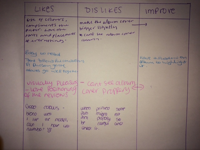
The poster got really good reviews and said it was really in keeping with the Digipak and artist identity and felt that it was visually pleasing. the one criticism that i got was to make the album cover bigger so that it was clear that that was what i was advertising.
Improvements:

The only thing that i really changed was the size of the digipak on the poster and added a subtle pink border around the outside to highlight it further without making it too bold.

No comments:
Post a Comment