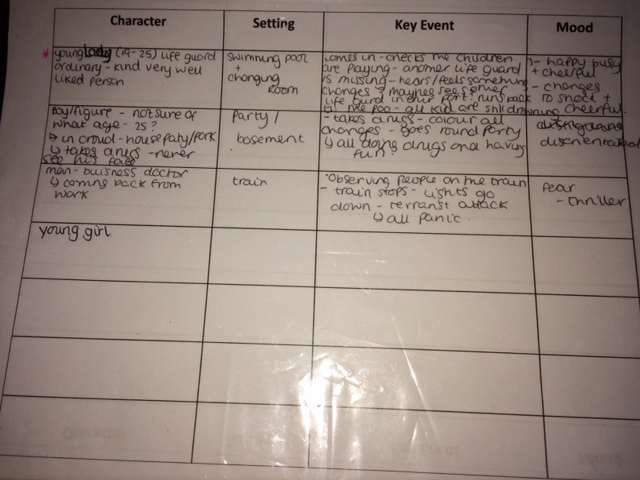
Tuesday, 29 December 2015
Casting and Location Recce
Casting and location Recce
Casting:
Jasmine: Aimee Paterson
Girl speaker: Pearl - Thomas
Swim teacher: Mrs. Kirby
Drowning kids: Year 8/ 9/10 volunteers:
Elena Constandinou (10L)
Isabel Sabourin (8n)
Katie Scott (8L)
Lola Walton (8L)
Pearl Thomas (8L)
Holly Hawkins (8L)
Homa Elechi (8L)
Emma Abdi (8L)
Ella Gormally (9v)
Sara ABukar- Ferrik (8R)
Sophie Hudson (8B)
Erona Maliqi (8R)
Isobel Nethercoast (8s)
Kate Murphy (8S)
Liyah Deules (8N)
Rosie leffman (8R)
Grace Brycelanb (8S)
Lorna Reid (8R)
Cerys Jones (8L)
Adriana Oliveira (8S)
Olivia Herbert (8L)
Amy leffmen (8s)
Problems
For my film opening to look believable, I needed a minimum of 12 students from lower down in the school to participate in my production. This proved to be very difficult as I first had to ask permission from the head teacher in order to make sure I was allowed to carry out my filming. At first, the senior Leadership team had a problem with 'safe guarding' as it would be in the swimming pool, so I had to draft a letter 3 different times, asking the parents/ guardians of the students, asking permission for their daughter to be able to participate as well as being filmed. The final draft of the letter was finally produced and I gave out 20 letters to two distinct forms. One of the form was very enthusiastic and keen to participate, where as the other form were less impressed and willing to participate. The re- draft of the letters also meant that it took a lot of time before I was able to give it out and ask the students, meaning that I gave as little notice as two days, before I was filming.
Although I made it extremely clear that they needed to bring in their reply slips the following morning, only 4 girls handed them in. This result made me very nervous and I was unsure that the day of the filming, I would have any more reply slips. At this point, it called for desperate measures, and I printed out another 25 letter to hand out to additional year 8 forms. The forms I visited, seemed very willing and Happy to help, which gave me great encouragement for my Production.
Thursday - filming day- I again went around to every form I handed out letters to during form time and I was flooded with reply slips form 22 girl that were happy and excited to participate. Although the problem of having to few actors, I was now faced with the opposite dilemma of having too many kids that would be difficult to control.
Sunday, 20 December 2015
Target Audience Profile
My Ideal Target Audience
Name: Emily Walsh
Age: 18
The area she lives in: Finchley
Occupation: Full time student studying journalism at Leeds university
Relationship Status: in a relationship with boyfriend Jake Goldsmith (age 19)
Insight into home and family life: When Emily is not living in her student housing in Leeds with close friends;Maria, Izzy, Ella. She lives in a semi- detatched house in finchley with her mother (Carol Walsh aged: 45 ) and step father (Bill Walsh aged: 48) and a little brother (Harry Walsh aged: 12)
Personality: Confident, lively, determined, enthusiastic, outgoing, aproachable, charming, spontanious, very active, when it comes to studying, emily takes a very lazy approach
Shops: Pull&Bear, New Look, Holister, Miss selfridge, super drug, Victoria Secrets, JD sports
Placed to eat Favorite food: Wagamamas, Nandos, Byron Handburgers, steak and chips, spagetti bolganase, Chick ceaser salad
University societies: Water polo, detabting society and film society.
Music Taste: Disclosure, Katie B, Adelle, s Club 7, Busted.
Interests and hobbies : interested in sport, interested in adventiourious activities (attends go ape sessions) loves the idea of the supernatural, likes to go to the cinema and go out with her friends. also into feminist literature
Favorite Tv shows: Ninja worior, Total wipe out, Friends, Big Bang theory, Great Brittish Bake off
movies: Incidious, The human centerpide, Jeepers Creepers, Chucky, Princess diarys, 10 things i hate about you, Finding Nemo
Favorite Tv shows: Ninja worior, Total wipe out, Friends, Big Bang theory, Great Brittish Bake off
movies: Incidious, The human centerpide, Jeepers Creepers, Chucky, Princess diarys, 10 things i hate about you, Finding Nemo
Dislikes: studying, reading, dislikes attending University seminars, Hair Extensions, Girls who wear lots of make up.
Drinks: coke, 7up, fanta fruit twist, beer.
Thursday, 10 December 2015
Final idea
Final idea for movie opening
Pitch:
My idea involves of a
female character (young adult) who is some sort of presumed life guard or swim
teacher for a group of 12-15 young kid. The main character, Jasmine, (supposedly
late for work) rushes through the side door to enter the building and sees the
kids are already in the swimming pool playing and messing around. Jasmine makes
a small remark that conveys a sense of suspicion to why they are unsupervised by a
fellow colleague. She casually asks one of the kids where ‘miss’ and the kid
dismissively reply’s with ‘I don’t know, she went out a minute ago’. The
character does not think twice about where her collogue is and just goes
through the corridor to the changing rooms (long tracking shot follows
character). The last shot of the children splashing around has a long shot
duration and almost lingers for a few seconds before moving and following the
main character to convey almost an
omnipresent presence that acts as a threat to the children which inevitably
should forebodes something bad is about to happen. The scene continues with the
main character quickly changing and putting her bag down (putting flip-flops
tops and life guard t shirt). There is a sense of a burden on the characters
conscience. The character takes a second to check herself in the mirror before
heading out.
A potential Idea I
was think was that whilst the character is collecting her thoughts in the
changing room, there should be sudden flashes and the children slowly starting
to drown where there is a sudden realisation that something may have happened.
As she leaves the mirror the shot lingers again and the
focus changes to the other side of the changing room where you see a bit of
hair (maybe fake blood) discreetly coming out from behind a wall. The main
character does not see this detail and returns to the swimming pool. As she enters the pool area, she sees that all children are face down floating and
all of them seem to be in a trace or worse dead. The rest of the title sequence
will consist of underwater shots of the children floating and moving around in
the water, panning from child to child. The scene ends with the assumption
something supernatural has taken place and jasmine is at the centre of it all.
Monday, 7 December 2015
Storyboard
Storyboard
Whilst creating my storyboard, it forced me to think of the four key micro elements; sound, editing, camerawork and mise-en-scene. I manily focused on camera angles, shot types and key props within mise-en-scene. This meant that i was able to map out my whole storyline as well as the actual shots which gave me an indication and clear vision of what i wanted my end product to look like. Likewise this was also helpful when i was filming as i knew what type of shots that i wanted to incorporate which kept me on task.
Thursday, 3 December 2015
Tuesday, 1 December 2015
Codes and conventions of thriller/ horror genra
Codes and Conventions
Shot types:
Editing:
Depth of field- focus on character
Blurring background- panic the audience
Slow paced editing - suspense and an unsettling feeling
Fast pace - chaos
Mise-en- scene
Colours (black and red)- connotes: death, evil, danger and the binary opposition between the two
Weapons- violence and danger associated with character
Bible- religious themes, supernatural and superstition
Character:
Protagonist- main focus- hero
Antagonist- monster, demons, ghosts, zombies, mutated freaks, serial killer/ psychopath
Death- careless teenager killed first
Police- authority figure
Themes :
Good Vs Evil
Revenge
Supernatural
Religion
Living dead (zombies or vampires)
scientific experiment gone wrong
Insanity
Nightmares
Lust
I have chosen this type of genre as i feel there is more devivices within the thriller genra that will accumilate a reaction from the audience as oposed to a comedy that could prove very dificult to excicute.
I am potentially looking at using some of these conventions such the supernatural which will be connoted through the inferred accident. Likewise, I will also incorporate the idea of long shot duration to accumulate suspense followed by quick short shots to satisfy the climax.
Friday, 20 November 2015
Title Analysis- back to the future
Thursday, 19 November 2015
Title Analysis- Harry Potter
Harry Potter
Harry potter is one example of the anomalies in film opening as it does not have a title sequence. Although this does not necessarily help my own film opening, it has enlightened me on the variety of film openings there are, despite the lack of title sequences, the films always present the Warner Brothers logo for a short amount of time before displaying the "Harry potter logo'.
What I did find useful was the use of typography in the opening sequence. The Harry Potter font resembles the genre of each film and the general atmosphere eg. The chamber or secrets and the philosopher stone has a gold typography, which mimics the innocence and youth in the character as opposed to the darker colours used in the equal mimicking how they have grown away from innocence and are maybe in danger.
Wednesday, 18 November 2015
10 things I hate about you- Typography

Colour:
- A variety of vivid bright colours reflect the range of characters and personality in the film as it needs to represent a school which has may different types of people.
- The brightness of the colours could mirror the characters 'in your face' personality and perhaps their crazy teenage life style.
- The colours it self also represent the youth and adolescence of the characters as adults are usually illustrated using darker more plain colours. This informs the audience of what age group the characters are, within the first 2 minutes of the film.
Font:
- The font type almost resembles a students messy handwriting which will also indicate what the film is about and the type of characters involved. Likewise the handwriting like font also creates a sense of familiarity with the audience as the type of people that would be watching the film will have handwriting that is similar or if they are out of the target audience, this will remind them of their youth.
- The typography colour be described as 'messy' which could also embody the characters, informing the audience that the characters could be wild teenagers.
Tuesday, 17 November 2015
Saturday Night Fever- opening scene
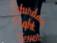
 Saturday night fever begins with a series of establishing shots located in new york city which sets up the setting for the entirety of the film. The initial font of the typography is a standard capital letter type which conveying nothing necessarily interesting about the setting. this is then juxtaposed against the more stylised font for the title. This puts emphasis upon the title and suggests that this is what the film is all about. This also excites the audience as the flashing typography of 'fever' is mirroring the outside display of a night club or bar.
 Sound track:
The sound track is an upbeat song by the bee-gees that was insanely popular song which could mimic his popularity and his fashionable trendy taste.
Likewise the fact that this character is walking to the rhythm which could also suggest that music and rhythm is an key factor in this film.
Costume:
The red shirt is a very striking vivid colour that is symbolic of romance and affection but also of danger. Within this movie the main character is both a womanizer but also seems to get into trouble
Similarly, the brightness of the red is also symbolic of his bright and charismatic personality as he is clearly standing out from the rest of the actors on screen.
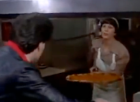
The fact that the women in the pizza place, is very familiar of the main character suggests he is well known and popular suggests he is well liked and a real positive feature to society.
We are here introduced properly to 'tony' as the women says his name so that the audience is given some information about him.
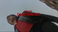 Extreme Low angle/ canted angel:
- Omnipotent
- Godlike
- Superiority in skill
- foreshadows talent?
Explicit subjects?
The fact that the typography covers the lower part of the female body, could suggest that there is some explicitly and sexual content in part of the film that could be key.
The camera at this point plays the view of the main character and tries to prevent the women from passing him by moving in her path. Although this may seem annoying and perverted if any character would do that but the fact that the women smiles, suggests she's not necessarily bothered and is amused by his persistence to chase her.
Wednesday, 11 November 2015
Casino Royal film opining analysis
Casino Royal film opining - analysis
 Casino royal's opening scene establishes the very image and principle of '007' as we whiteness to two different encounters where bond uses his 'licence to kill'.
This brutal reality the audience is immediately exposed to, conjures an intense and threatening atmosphere which informs us on the field of work Bond is associated with. Although Bond in previous films is portrayed as the protagonist, in the beginning of casino royal, Bond is is seen more dangerous and violent which causes us to question his morality and good intentions.
mise- en- scene
 |
Costume: Smart wear- suit.
- Smart business atire that formalises and labels his professionalism.
- Hightens his status and makes him seem more authoritative and in control
- Not very practical, shows the skill and ability to fight in anything
Setting:
- Black and white tint on screen suggests that it is a harsh reality where humanity is not key
- Dirty bathroom is significant in portraying the awful things that is part of his job
- Image of dirt relates to un moral and disgust which conveys the dangers within the life of an 00 agent.
Sound:
The classic james bond soundtrack acts as a leit motif for the character. The use of classical instruments including violins creates a sense of sophistication and class which suggests that James Bond is a character that is valued. Moreover, in most renditions the quick repetitive base guitar is used to an undertone in the piece which reflects almost quick and swift movement. This part of the liet motif reflects his skill and his profession as he needs to be able to carry out missions effectively. Likewise the repetitiveness of the track also resembels how his profession is his life and he is undercover.
Tuesday, 10 November 2015
Saul bass
The life of Saul Bass
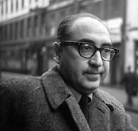
Saul Bass was a graphic designer and filmmaker, perhaps best known for his design of film posters and title sequences.
During his 40-year career Bass worked for some of Hollywood’s greatest filmmakers, including Alfred Hitchcock, Stanley Kubrick, Otto Preminger, Billy Wilder, and Martin Scorsese.
video: The man with the golden arm
Quote- "My initial thoughts about what a title can do was to set mood and the prime underlying core of the film’s story, to express the story in some metaphorical way. I saw the title as a way of conditioning the audience, so that when the film actually began, viewers would already have an emotional resonance with it.” — Saul Bass
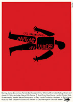
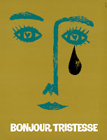
Not only did Saul Bass create film openings but he also created my posters for films and other sort of media.
Wednesday, 14 October 2015
Life on Mars re-creation
Life On Mars
Research and planning:
As part of our planning we first watched the clip to inform ourselves on the content of the extract and then we worked methodically through it, identifying the shots. We also documented the shot duration, shot type and key details featuring the mise-en-scene. By recorded these crucial details, this task will be significant help in replicate this extract as accurately as possible.
We also double checked our data by confirming detail with the other groups which made our results more accurate.
Time and location rekey
Our next task required us to brainstorm locations of where we would replicate the shots which resembles the mise- en-scene and background in the extract. We decided that we were going to focus our filming in 5 main areas which had similar qualities to the extract but was also accessible to us during school hours.
Likewise we also listed props that we would need which would help make our footage seem more realistic. Although we do not have the exact replica of the props and costumes in the clip, we thought of alternatives that could be utilised for the same purpose and effect.
Filming experience
My filming experience was fairy successful as I managed to capture all the shots i needed to recreate the extract from life on mars. During my experience i found that the lighting caused a minor problem as i wanted to capture the sunlight in a specific angle whilst still having the greenery in the background. despite this issue proving most difficult we managed to capture some shots that were appropriate. likewise another problem that accumulated whilst filming, was during the first scene where we unconsciously positioned Aimee lying the wrong way which meant we had to re-film. Although this meant that we needed more time to film, this made all our footage correct. Other than these two factors the rest of my filming experience went really well.
Editing experience
Editing my recreation of the life on mars extract proved both difficult and frustrating at certain points which helped me to learn about the process. For example the primary struggle that accumulated was the beginning shot. we filmed excellent footage of our characters eyes but then came to he realisation that she was lying the in opposite direction in which resembled the clip. we first tried to mirror the footage using some sort of editing tool. in order to save time. I searched ways in which this could be done but only effects that applied to a more up to date software allowed you to do this. despite the hassle, we decided to re-film this section of the sequence and correct our previous mistake.
likewise another struggle that occurred was finding the right shots that mimicked the extract as much as possible. As i filmed a verity of of different shot types of the greenery, it was difficult to distinguish between them and choose the best footage as they were all fairly similar.
After finally choosing the best pieces of camerawork it was fairly easy editing them together by following the timetable that we previously had made for our research and planning exercise.
A further complication during my editing experience was trying to replicate the exact shot durations as the software i am using is not very advanced so did not show the exact timings. Equally as we were missing the beginning of clip due to complications i mentioned earlier, this also added to the difficulty or reconstructing the extract.
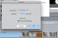
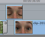 In continuation, another complication was the shot duration as many of the footage was not long enough meaning i had to either duplicate the same footage, add parts of other footage or slow down the speed to make the shot duration longer.

 In continuation, another complication was the shot duration as many of the footage was not long enough meaning i had to either duplicate the same footage, add parts of other footage or slow down the speed to make the shot duration longer.
 |
| Colour corrector |
I did this discretely by changing the footage to similar footage when the person blinked. This meant when the person re- opened their eye, you would not be able to tell that i changed the footage had changed as i also altered the video filter so they would be identical.
Wednesday, 7 October 2015
Continuity Exercise
Continuity Exercise Reflection
We were presented with a task whereby we would have to create a short clip of an encounter between two people where we would have to include the three continuity rules: match on match action, the 180 degree rule and shot reverse shot.
Match on Match Action
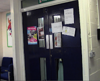
Whilst filming this exercise I realised the importance of the 'match on match action' rule as it required us to edit sufficiently so that it eradicated the possibility of showing an event happening twice.
 For example
it would have been very easy to have first edited the character opening the
door and then from the second shot filmed her re- opening the door from another angle.
This could have been an easy mistake but by following the match on match action rule, we made a conscience effort to avoid making this error even whilst filming.
180 Degree Rule
The 180 degree rule requires the camera shorts to be filmed on one side of the conversation in order to keep the audience orientated. This was fairly difficult as it meant we were limited in the amount of shots and spaces we could uses in order to satisfy the rule. Apart from the initial difficulty, we quickly adapted and chose angles within 180 degrees from our first camera angel.
Shot Reverse Shot
Shot revers shot was part of the components that we had to incorporate within our short clip to convey both sides of the conversation. This was very important within our sequence as it conveyed to the audience the anger and emotion of the characters. This informed them of who was more dominant andwhat their feelings were towards the other person.
Subscribe to:
Comments (Atom)


