Friday, 20 November 2015

Title Analysis- back to the future

Title Analysis  

Back to the future

Back To The Future utalises 18 different credits which is slightly higher than many of the other film openings.


Thursday, 19 November 2015

Title Analysis- Harry Potter

Harry Potter


Harry potter is one example of the anomalies in film opening as it does not have a title sequence. Although this does not necessarily help my own film opening, it has enlightened me on the variety of film openings there are, despite the lack of title sequences, the films always present the Warner Brothers logo for a short amount of time before displaying the "Harry potter logo'.

What I did find useful was the use of typography in the opening sequence. The Harry Potter font resembles the genre of each film and the general atmosphere eg. The chamber or secrets and the philosopher stone has a gold typography, which mimics the innocence and youth in the character as opposed to the darker colours used in the equal mimicking how they have grown away from innocence and are maybe in danger.

Wednesday, 18 November 2015

10 things I hate about you- Typography


'10 Things I Hate About You' uses a specific type of typography that will appeal and reflect the content of the film but also targets its demographic.

Colour: 
  • A variety of vivid bright colours reflect the range of characters and personality in the film as it needs to represent a school which has may different types of people. 
  • The brightness of the colours could mirror the characters 'in your face' personality and perhaps their crazy teenage life style. 
  • The colours it self also represent the youth and adolescence of the characters as adults are usually illustrated using darker more plain colours. This informs the audience of what age group the characters are, within the first 2 minutes of the film.
Font:
  • The font type almost resembles a students messy handwriting which will also indicate what the film is about and the type of characters involved. Likewise the handwriting like font also creates a sense of familiarity with the audience as the type of people that would be watching the film will have handwriting that is similar or if they are out of the target audience, this will remind them of their youth. 
  • The typography colour be described as 'messy' which could also embody the characters, informing the audience that the characters could be wild teenagers. 


Tuesday, 17 November 2015

Saturday Night Fever- opening scene

Saturday night fever begins with a series of establishing shots located in new york city which sets up the setting for the entirety of the film. The initial font of the typography is a standard capital letter type which conveying nothing necessarily interesting about the setting. this is then juxtaposed against the more stylised font for the title. This puts emphasis upon the title and suggests that this is what the film is all about. This also excites the audience as the flashing typography of 'fever' is mirroring the outside display of a night club or bar. 

Sound track: 
The sound track is an upbeat song by the bee-gees that was insanely popular song which could mimic his popularity and his fashionable trendy taste. 

Likewise the fact that this character is walking to the rhythm which could also suggest that music and rhythm is an key factor in this film. 


Costume: 
The red shirt is a very striking vivid colour that is symbolic of romance and affection but also of danger. Within this movie the main character is both a womanizer but also seems to get into trouble 

Similarly, the brightness of the red is also symbolic of his bright and charismatic personality as he is clearly standing out from the rest of the actors on screen. 


The fact that the women in the pizza place, is very familiar of the main character suggests he is well known and popular suggests he is well liked and a real positive feature to society. 

We are here introduced properly to 'tony' as the women says his name so that the audience is given some information about him. 


Extreme Low angle/ canted angel:

  • Omnipotent 
  • Godlike 
  • Superiority in skill 
  • foreshadows talent? 


Explicit subjects?
The fact that the typography covers the lower part of the female body, could suggest that there is some explicitly and sexual content in part of the film that could be key. 


The camera at this point plays the view of the main character and tries to prevent the women from passing him by moving in her path. Although this may seem annoying and perverted if any character would do that but the fact that the women smiles, suggests she's not necessarily bothered and is amused by his persistence to chase her. 


Wednesday, 11 November 2015

Casino Royal film opining analysis


Casino Royal film opining - analysis 

 Casino royal's opening scene establishes the very image and principle of '007' as we whiteness to two different encounters where bond uses his 'licence to kill'. 

This brutal reality the audience is immediately exposed to, conjures an intense and threatening atmosphere which informs us on the field of work Bond is associated with. Although Bond in previous films is portrayed as the protagonist, in the beginning of casino royal, Bond is is seen more dangerous and violent which causes us to question his morality and good intentions. 


mise- en- scene 


Costume: Smart wear- suit. 
  • Smart business atire that formalises and labels his professionalism. 
  • Hightens his status and makes him seem more authoritative and in control 
  • Not very practical, shows the skill and ability to fight in anything 


Setting:
  • Black and white tint on screen suggests that it is a harsh reality where humanity is not key 
  • Dirty bathroom is significant in portraying the awful things that is part of his job 
  • Image of dirt relates to un moral and disgust which conveys the dangers within the life of an 00 agent. 
Sound:
The classic james bond soundtrack acts as a leit motif for the character. The use of classical instruments including violins creates a sense of sophistication and class which suggests that James Bond is a character that is valued. Moreover, in most renditions the quick repetitive base guitar is used to an undertone in the piece which reflects almost quick and swift movement. This part of the liet motif reflects his skill and his profession as he needs to be able to carry out missions effectively. Likewise the repetitiveness of the track also resembels how his profession is his life and he is undercover. 


Tuesday, 10 November 2015

Saul bass

The life of Saul Bass 


Saul Bass was a graphic designer and filmmaker, perhaps best known for his design of film posters and title sequences.
During his 40-year career Bass worked for some of Hollywood’s greatest filmmakers, including Alfred Hitchcock, Stanley Kubrick, Otto Preminger, Billy Wilder, and Martin Scorsese.


video: The man with the golden arm 


Quote- "My initial thoughts about what a title can do was to set mood and the prime underlying core of the film’s story, to express the story in some metaphorical way. I saw the title as a way of conditioning the audience, so that when the film actually began, viewers would already have an emotional resonance with it.” — Saul Bass

Not only did Saul Bass create film openings but he also created my posters for films and other sort of media.

Examples: from these examples you can see a similarity to all of them. the majority of his creations are fairly simplistic but ambiguously very metaphoric and symbolic of the film and central character


 Saul bass's work has helped me with ideas for my own film opening as it has reminded me of the power within simplicity. For instance, as I am not equipped with the top software to film and edit my opening sequence, having a key theme that is at first glance basic but alternately has many symbolic features that are representative of my back story. 


Wednesday, 14 October 2015

Life on Mars re-creation


Life On Mars 

Research and planning:

As part of our planning we first watched the clip to inform ourselves on the content of the extract and then we worked methodically through it, identifying the shots. We also documented the shot duration, shot type and key details featuring the mise-en-scene. By recorded these crucial details, this task will be significant help in replicate this extract as accurately as possible.
We also double checked our data by confirming detail with the other groups which made our results more accurate.


Time and location rekey

Our next task required us to brainstorm locations of where we would replicate the shots which resembles the mise- en-scene and background in the extract. We decided that we were going to focus our filming in 5 main areas which had similar qualities to the extract but was also accessible to us during school hours.


Likewise we also listed props that we would need which would help make our footage seem more realistic. Although we do not have the exact replica of the props and costumes in the clip, we thought of alternatives that could be utilised for the same purpose and effect.

Filming experience 

My filming experience was fairy successful as I managed to capture all the shots i needed to recreate the extract from life on mars. During my experience i found that the lighting caused a minor problem as i wanted to capture the sunlight in a specific angle whilst still having the greenery in the background. despite this issue proving most difficult we managed to capture some shots that were appropriate. likewise another problem that accumulated whilst filming, was during the first scene where we unconsciously positioned Aimee lying the wrong way which meant we had to re-film. Although this meant that we needed more time to film, this made all our footage correct. Other than these two factors the rest of my filming experience went really well.

Editing experience 
Editing my recreation of the life on mars extract proved both difficult and frustrating at certain points which helped me to learn about the process. For example the primary struggle that accumulated was the beginning shot. we filmed excellent footage of our characters eyes but then came to he realisation that she was lying the in opposite direction in which resembled the clip. we first tried to mirror the footage using some sort of editing tool.  in order to save time. I searched ways in which this could be done but only effects that applied to a more up to date software allowed you to do this. despite the hassle, we decided to re-film this section of the sequence and correct our previous mistake.


likewise another struggle that occurred was finding the right shots that mimicked the extract as much as possible. As i filmed a verity of of different shot types of the greenery, it was difficult to distinguish between them and choose the best footage as they were all fairly similar. 
After finally choosing the best pieces of camerawork it was fairly easy editing them together by following the timetable that we previously had made for our research and planning exercise. 

A further complication during my editing experience was trying to replicate the exact shot durations as the software i am using is not very advanced so did not show the exact timings. Equally as we were missing the beginning of clip due to complications i mentioned earlier, this also added to the difficulty or reconstructing the extract.
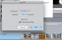
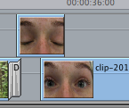
In continuation, another complication was the shot duration as many of the footage was not long enough meaning i had to either duplicate the same footage, add parts of other footage or slow down the speed to make the shot duration longer.


Colour corrector 
I did this discretely by changing the footage to similar footage when the person blinked. This meant when the person re- opened their eye, you would not be able to tell that i changed the footage had changed as i also altered the video filter so they would be identical.

In conjunction, apart from these glitches, i found the rest of the experience very smooth and easy as i have practiced my editing skills in my GCSE practical exam for example, adding flash frames was not possible but i quickly realised i could create a similar effect by using the dip to white video transition.


I also implimented a transition so that i could overlap the same footage but backwards as i didn't have enough of that type of footage.  This saved me both time and effort not having to film more footage.